Well Bean Coffee
Logo | Concept | Brand Guidelines
Well Bean is an American coffee trading company that prides itself on sourcing, roasting, and trading coffee exclusively within the USA. Committed to sustainability and ethical practices, Well Bean promotes eco-friendly methods throughout its operations and ensures that all coffee is ethically sourced. Well Bean for our well-being.
The Challenge
To create a brand and design comprehensive branding package for Well Bean, encompassing naming, logo design, and additional brand elements as required. Additionally, to design a booklet outlining the brand guidelines to ensure consistency across all brand assets and communications.
Inspiration & Ideation
Mood Board
The branding for Well Bean aims to evoke a warm and authentic ambiance, reminiscent of homemade comforts and rustic American trade. Drawing inspiration from the atmosphere of southern kitchens and hand-painted mugs, it's crucial to convey a sense of comfort and trust in Well Bean's branding, highlighting its eco-friendly and ethical practices. By incorporating sustainability and ethical sourcing, it reinforces the idea that supporting Well Bean is both comforting and responsible, appealing to consumers who value quality and conscience in their purchasing decisions.
Sketches
During the sketching process, I delved into capturing the essence of coffee cultivation, aiming for a serene yet rustic aesthetic by using the coffee plant and use of hands to recall the idea that the brand is conscience from the start, to finish.
Digital Drafts
Round 1
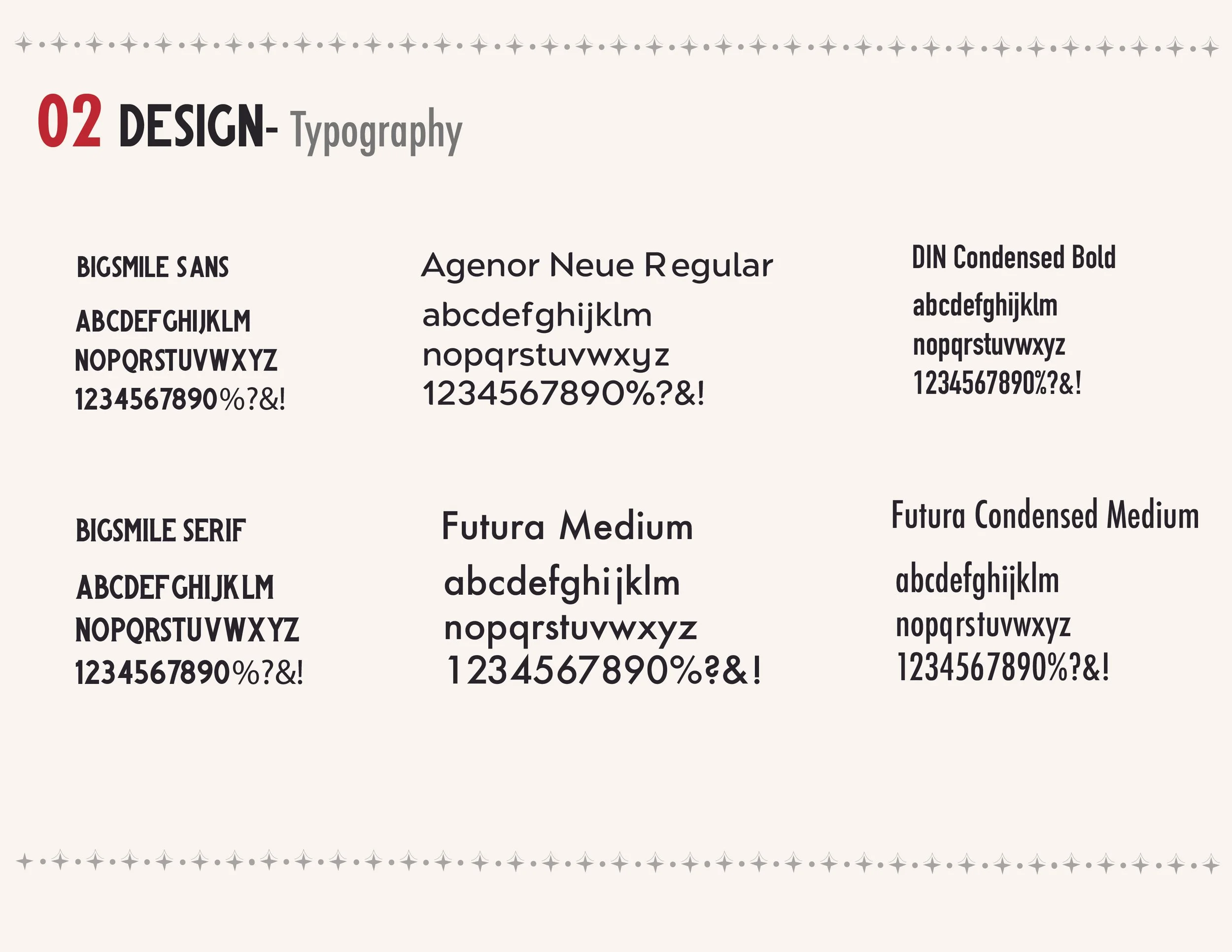
Transitioning to digital drafts, I started exploring typefaces that would complement the tone I aimed for, intending to pair with the coffee plant to emphasize the importance of coffee farming to the brand identity.
Round 2
As the project progressed, I focused on refining two logos that showed promise. Ultimately, I chose the logo featuring the hand picking the coffee plant, as it better represented the core of the brand much better.
Final Design
Logo Overview
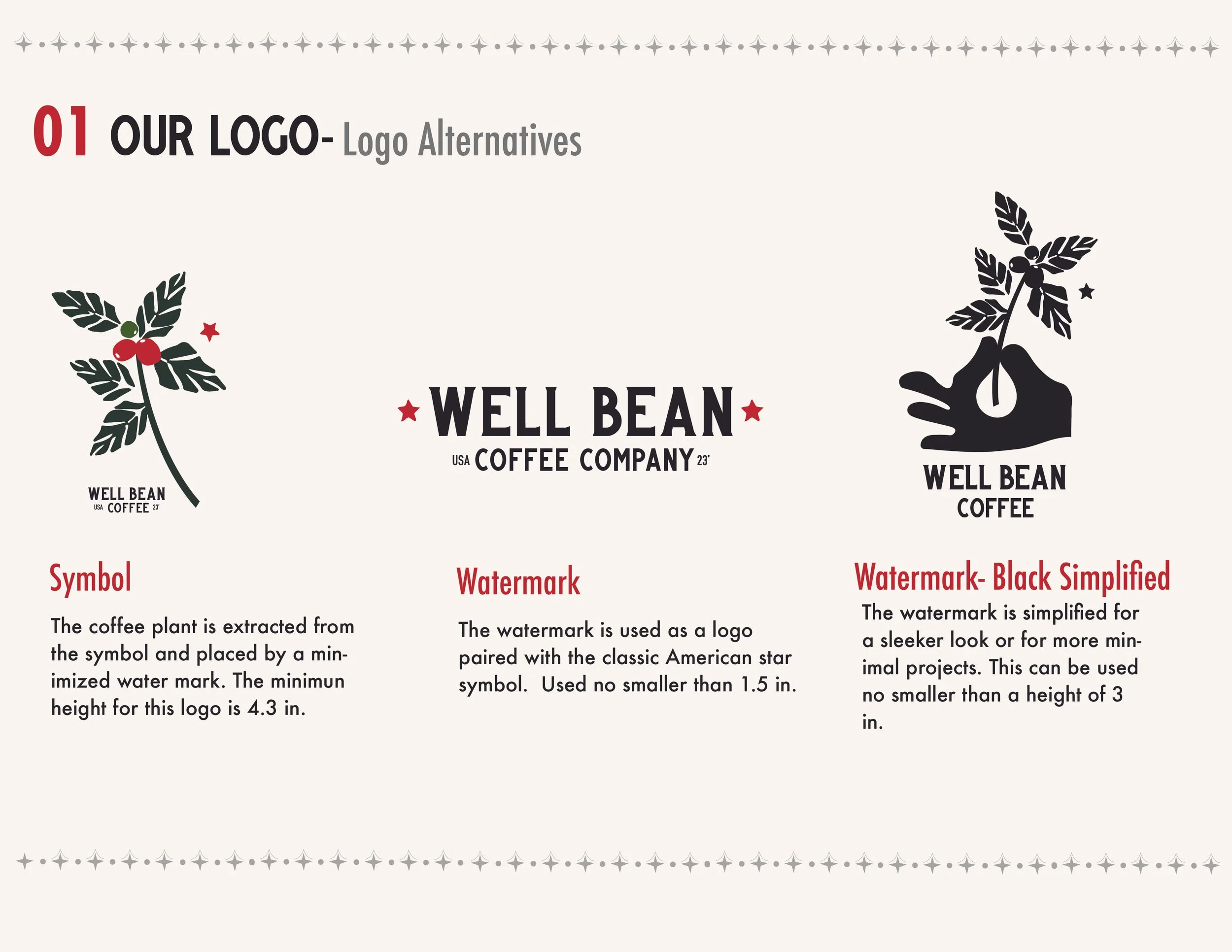
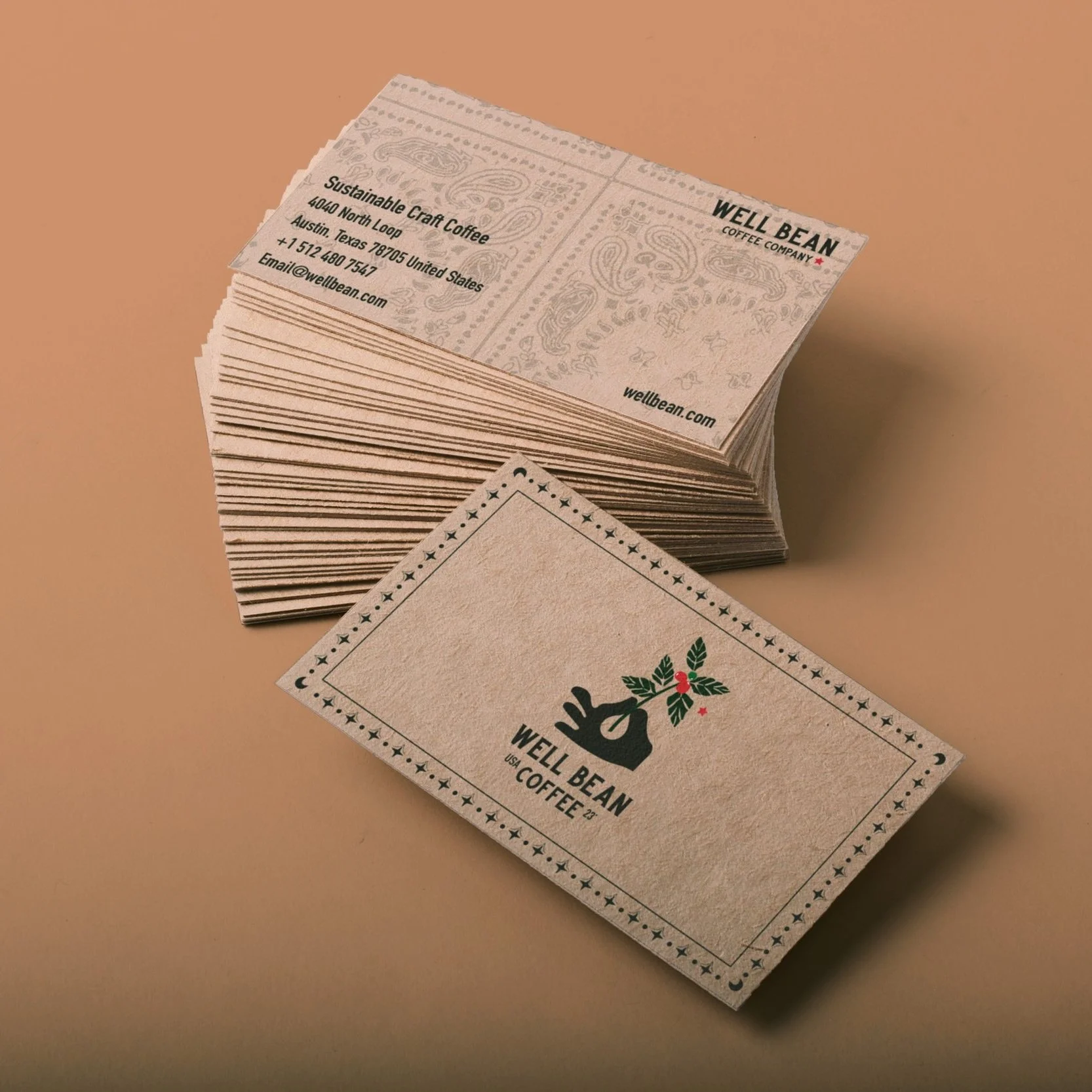
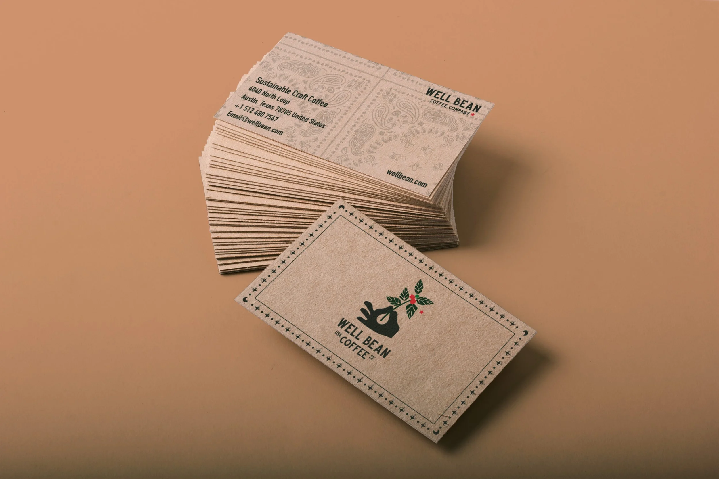
I decided to move forward with the depiction of a hand picking the coffee cherry plant, emphasizing the connection to the often-overlooked individuals involved in the process. Additionally, the color variation of the coffee cherries illustrates different phases of development. I incorporated "USA" and "23'" as markers for the brand's origin and creation date, drawing on traditional American markings.
Mockups
Reflection
Having spent eight years as a barista, creating a coffee brand focused on ethical practices and expanding American coffee culture felt deeply personal. I enjoyed highlighting the origins of the coffee and the people behind its cultivation, often overlooked in businesses lacking ethical practices. Integrating American trade without veering into overt patriotism was a challenge, but staying true to the brand's authenticity was important. Moving forward, I'm excited to envision the coffee space and expand into creating more coffee bags, flavors, and branding packaging.


