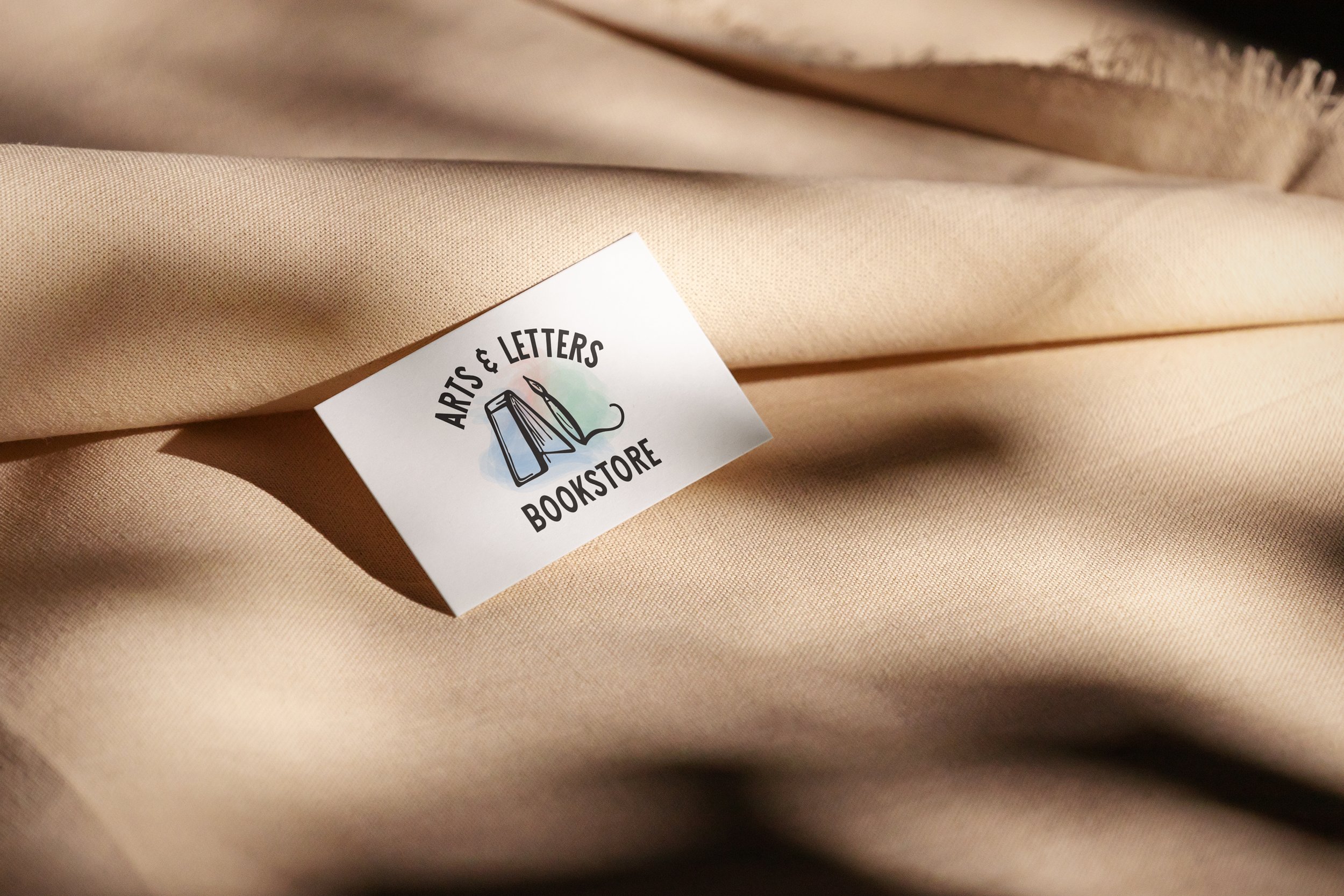
Arts & Letters Bookstore
Logo Rebranding
Arts & Letters is a bookstore located in the historical downtown of Granbury, Texas, founded in October 2019. The business aims to create a welcoming "third space" away from home, where the community can gather, share, and discuss their favorite reads. Prioritizing customer satisfaction, Arts & Letters strives to provide the best possible experiences and expand readers' horizons. The bookstore is dedicated to fostering community connections through the joy of reading.
The Challenge
The challenge is to redesign a logo for an existing brand. The current branding for the store features a simple ornamentation of an intertwined A and L. The colors used, classic green and red, symbolize education and learning. While the signage highlights reading, the store also provides painting and craft materials. Adding elements of craftiness and arts into the logo will further imply what the store provides, while also instilling some excitement and intrigue for new customers.
Current Logo:
Inspiration & Ideation
Moodboard
When crafting my moodboard, I drew initial inspiration from vintage hand-lettered fonts, library stamps found in books, and the art of painting. I gravitated towards brighter versions of primary colors to infuse the logo with a lighter, more airy feeling, reminiscent of the bookstore's ambiance when you step inside.
Sketches
In my sketching process, I created a matrix to blend and mesh adjectives and icons of the book store. Using this method helped generate new ideas on how to utilize different objects to be something else, or create stand alone logos. This led into my next sketches
Digital Drafts
After generating ideas through sketching, I refined my top concepts into digital sketches. These concepts were the most effective in conveying the essence of the book and craft store, infusing it with a renewed vibe. Ultimately, I chose the third logo as it successfully captures both the essence of books and crafts, while still maintaining an educated aesthetic with added flair.
Final Design
Reflection
The challenge for this project was twofold: appealing to the store's specific audience while also ensuring the logo aligned with the historical downtown boutique style. Focusing on characteristics of why people are drawn to this store and area—friendly, calm, historic, and crafty—allowed me to generate ideas and characteristics for the logo. Upon finalizing my logo, I felt confident that I had successfully executed the desired tone and appeal.


